Designing Candles
- ceryss5
- Aug 17, 2023
- 1 min read
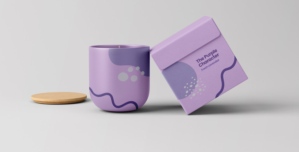
I had the idea early on in the project to design some candles that would be scented differently for each colour character. When it came to designing a candle, I knew I needed to find the perfect candle mock-up. Most of the candles I found were glass with a plain white candle and I didn't feel like these matched the aesthetic I was going for. I had pictured a matte ceramic texture for the candle and it took a lot of searching but I found a mock-up that I felt allowed me to design a candle that I loved.
Rather than making a design and putting it on a mock-up, with these candles I worked directly with the mock-up, as I was mainly just designing the packaging. I used the shapes that I created for my website to decorate the packaging and the candle itself to make sure they felt tied into my brand identity. I also made sure to use the same font that I have used throughout my website to achieve this.
Here are the final products:
I am really happy with these. I found it difficult to choose the scents for each candle but I am happy that I made them customised to their colour and feel like there would be room to create more with this concept.


Comments